The Kime Conversation
A Certain Sensibility - focusing on fabrics from the Robert Kime Collection
"With some of my fabrics, with many of them actually, when they first go up, you don't think you've put up a pattern, you think you've put up an atmosphere."
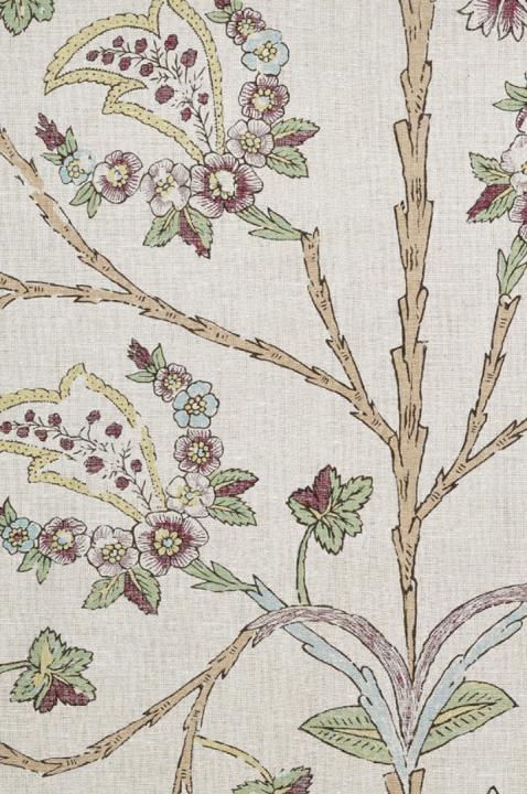
When Robert began decorating houses, he used, as had always been his practice, document textiles to cover sofas and ottomans, to fashion curtains and the final layer of pattern and texture. As the jobs got bigger and the supplies of document textiles got smaller, Robert designed a fabric for the job then at hand in New York City. Tree of Life, notably and interestingly, was Robert’s first fabric design. Since then, the collection of fabric designs has grown - always based on documents from Robert’s own archives. Many of the designs are available in a single colourway, as this is how Robert sees the interpretation from the document. And yet there is a loose thread that runs through everything, colours are carried through, the weight and variety of the backcloth is considered and the attention to the small detail in pattern or weave is a decisive dialogue.
In an ongoing conversation here, Robert details some of the stories behind the fabrics. His unerring focus on creating designs that are useful, authentic and interesting. How he might use a fabric or why he decided to make it in the first place may get touched upon. And in the end, the hope is, as you look at a Robert Kime fabric, you too get a bit of the story, a sense of what Robert was after when he dug into the archive, bought a headscarf off of a fellow passenger on a bus or stood in a shop the size of a cupboard in Japan and thought - ‘oh, I like that.’
In an ongoing conversation here, Robert details some of the stories behind the fabrics. His unerring focus on creating designs that are useful, authentic and interesting. How he might use a fabric or why he decided to make it in the first place may get touched upon. And in the end, the hope is, as you look at a Robert Kime fabric, you too get a bit of the story, a sense of what Robert was after when he dug into the archive, bought a headscarf off of a fellow passenger on a bus or stood in a shop the size of a cupboard in Japan and thought - ‘oh, I like that.’
Bergama
This is one of our Kandillis - and Kandilli is where they do block prints, wonderful patterns, in Turkey. Bergama has very lovely colours together and makes the most beautiful curtains; I like curtains that are 1.5 widths together, rarely more - so that you can see the pattern. If curtains in fabrics of this size pattern are too full, the pattern is lost and this has such a nice one. We do it on 2 backcloths, the Bastian linen, and a lighter linen and it is very different based on that detail alone.
Contadour
The original is at La Gonette and I love the pattern. There is something so old-fashioned about Contadour’s pattern, almost no colour but in fact, it is pale blue, pink and green; and the way the corn sheaf is only just printed makes it so interesting. We used it as walling in a bedroom at a project in France and when it first goes up, you don’t think you’ve put up a pattern, you think you’ve put up an atmosphere. It is that subtle.

Karsamba
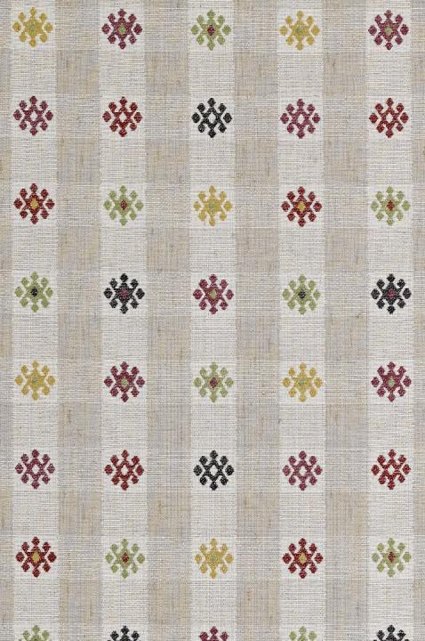
Originally a tent hanging, I think it is very useful because it is not obviously one colour, but it goes with so much. Karsamba is an organised pattern that is still interesting. As a weave, it is good for upholstery and very hard wearing. We have the original, which I bought 30 years ago hanging upstairs at the shop. Karsamba makes a nice base in a modern house or works equally well in a cosy drawing room; we made it as a weave because it needs that texture to be true to the original.
Ashoka Stripe
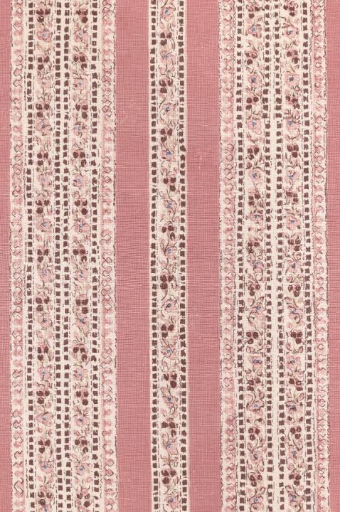
We actually had the panel first, taken from an 18th C Turkish document, and we designed Ashoka to be sold individually - the pink is good, not too pale. We then decided to make Ashoka Stripe from the border on the panel. The panel is excellent on a bed or wall and the stripe as upholstery or mixing with antiques. I wouldn’t falter to put this in a panelled study or a light drawing room, the pink has a depth to it.
We use cookies to personalise and enhance your experience on our site. Visit our Privacy Policy to learn
more.
By using our site, you agree to our use of
cookies.


